互聯網中網站制作10大排版方式
來源:尚品中國|
類型:網站百科|
時間:2013-08-28
網站制作排版的基本方式主要包括骨骼方式、全屏、分割、中軸、曲線、傾斜、對稱、焦點、三角、自由方式10種。下面依次介紹:
1.骨骼網站排版
骨骼方式排版是一種規范的分割方式,與報刊的版式相似,常見的骨骼方式有豎身的通欄,雙欄,三欄,四欄,和橫向的通欄、雙欄、三欄和四欄等。在通常的情情下以豎身分欄為多。這種版式能讓人感覺到和諧和理性的美。如果將幾種分欄方式結合起來,則會給人一種既理性雙活潑的感覺。
Skeletal pattern layout is a standard segmentation methods, and the newspaper layout similarity, common bone with vertical body's banner, double column, three column, four column, and the horizontal column, double column, three column and four column. The change in vertical columns for more. This layout can let a person feel the harmonious and rational beauty. If the column combination, it can give a person a kind of rational double lively feeling.
2.全屏網站排版
全屏方式的網站以圖片充滿整個頁面。營銷型網站建設上也主要以圖像為主,同時也可將一些文字置于圖片之上,這樣的版面視覺傳達效果比較強烈,讓人感覺舒展和大方。隨著網絡寬帶的發展和普及,這種版式和網站制作中的運用會越來越多。
Full screen mode with the entire page site with pictures. The site is mainly based on image, but also can be placed in the picture above some text, this page visual effect is strong, let a person feel the stretch and generous. With the development and popularization of the broadband network, use this format and production site will be more and more..jpg)
3.網站分割式排版
分割式排版是指把整個頁面分成上下或左右兩部分,在頁面中分別編排圖片和文本,使兩個部分形成明顯的對比,有圖片的部分讓人感覺到活力,而文本的部分則會讓人感覺到理性和平靜。可以通過調整圖片和文字所占的比例來調節對比的強弱。如果圖片所占比例過大,文本使用的字體過于前夕,字里行間的編排又稀疏,就會讓人感覺到心理上的失衡,顯得較生硬。如果對文字或圖片分割線進行虛化處理,就會讓人感覺自然而和諧。
Split type layout refers to the entire page is divided into the upper and lower or about two parts, pictures and texts are arranged on the page, so that the two parts form a contrast, a part of the picture to make people feel that the vigor, and part of the text will make people feel the rational and calm. By adjusting the proportion of picture and text to adjust the contrast intensity. If the proportion is too large, the font used too Eve, between the lines of the layout and sparse, can let a person feel psychological imbalance, appear more blunt. If the virtual processing of text or image segmentation, can let a person feel natural and harmonious.
4.中軸式網站排版
中軸式是指沿著瀏覽器窗口的中軸將圖片或文字以水平或垂直方式排列的一種版面。水平排列的頁面讓人感覺穩定、平靜和含蓄;而垂直排列的頁面則讓人感覺舒暢。
The axis is an axis along the layout of the browser window to image or text arranged in horizontal or vertical mode. Horizontal arrangement of the page to let a person feel stable, calm and reserved; while the vertical arrangement of the page is to let a person feel comfortable..jpg)
5.網站曲線式排版
曲線式是指將圖片、文字在頁面上進行曲線分割或編排構成的版面,能產生一種有韻律與節奏的美感。
Curve type refers to the pictures, text segmentation or editorial layout on the page, can produce a rhythm and the rhythm of beauty.
6.傾斜式網站排版
傾斜式是指將圖片,文字呈現出傾斜的狀態,產生強烈的動感,有很強的視覺沖擊力。
7.對稱式網站排版
對稱式一般可以分為左右對稱、上下對稱和四角對稱,可以產生穩定、理性的感受。在這類排版方式中應該使用相對對稱的方式,以避免頁面過于呆板。
Symmetry can generally be divided into left and right symmetry, symmetry and symmetry on the four angle, can generate stable, rational feeling. Should use relative symmetry in the way of this kind of style, in order to avoid the page is too stiff.
8.網站焦點方式排版
焦點方式是通過文字、圖片等設計元素,將人們的視線信中在一個中心焦點上,產生強烈的視覺盛宴。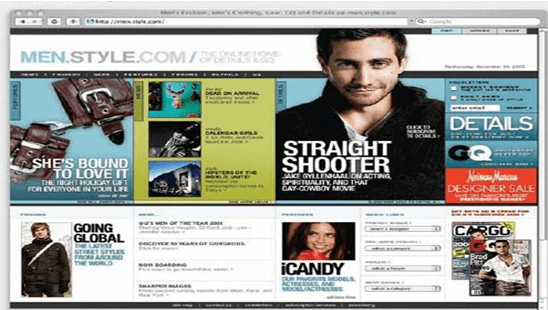
9.三角式網站排版
三角排版方式是通過設計元素將網站中的元素排列成三角形,產生穩定感同時又不是生動,給人以均衡的感受。
Triangular typesetting way is by design elements will elements on the website are arranged in a triangular configuration, produce a sense of stability and not vivid, give a person with the balanced feeling.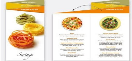
10.自由排版網站
自由排版方式中的元素自由搭配,產生動感。設計這類版式時注意避免設計元素分布過于凌亂。
Element free style of collocation, and generate dynamic. The design of this kind of layout to avoid distribution is too messy design elements.
1.骨骼網站排版
骨骼方式排版是一種規范的分割方式,與報刊的版式相似,常見的骨骼方式有豎身的通欄,雙欄,三欄,四欄,和橫向的通欄、雙欄、三欄和四欄等。在通常的情情下以豎身分欄為多。這種版式能讓人感覺到和諧和理性的美。如果將幾種分欄方式結合起來,則會給人一種既理性雙活潑的感覺。
Skeletal pattern layout is a standard segmentation methods, and the newspaper layout similarity, common bone with vertical body's banner, double column, three column, four column, and the horizontal column, double column, three column and four column. The change in vertical columns for more. This layout can let a person feel the harmonious and rational beauty. If the column combination, it can give a person a kind of rational double lively feeling.
2.全屏網站排版
全屏方式的網站以圖片充滿整個頁面。營銷型網站建設上也主要以圖像為主,同時也可將一些文字置于圖片之上,這樣的版面視覺傳達效果比較強烈,讓人感覺舒展和大方。隨著網絡寬帶的發展和普及,這種版式和網站制作中的運用會越來越多。
Full screen mode with the entire page site with pictures. The site is mainly based on image, but also can be placed in the picture above some text, this page visual effect is strong, let a person feel the stretch and generous. With the development and popularization of the broadband network, use this format and production site will be more and more.
3.網站分割式排版
分割式排版是指把整個頁面分成上下或左右兩部分,在頁面中分別編排圖片和文本,使兩個部分形成明顯的對比,有圖片的部分讓人感覺到活力,而文本的部分則會讓人感覺到理性和平靜。可以通過調整圖片和文字所占的比例來調節對比的強弱。如果圖片所占比例過大,文本使用的字體過于前夕,字里行間的編排又稀疏,就會讓人感覺到心理上的失衡,顯得較生硬。如果對文字或圖片分割線進行虛化處理,就會讓人感覺自然而和諧。
Split type layout refers to the entire page is divided into the upper and lower or about two parts, pictures and texts are arranged on the page, so that the two parts form a contrast, a part of the picture to make people feel that the vigor, and part of the text will make people feel the rational and calm. By adjusting the proportion of picture and text to adjust the contrast intensity. If the proportion is too large, the font used too Eve, between the lines of the layout and sparse, can let a person feel psychological imbalance, appear more blunt. If the virtual processing of text or image segmentation, can let a person feel natural and harmonious.
4.中軸式網站排版
中軸式是指沿著瀏覽器窗口的中軸將圖片或文字以水平或垂直方式排列的一種版面。水平排列的頁面讓人感覺穩定、平靜和含蓄;而垂直排列的頁面則讓人感覺舒暢。
The axis is an axis along the layout of the browser window to image or text arranged in horizontal or vertical mode. Horizontal arrangement of the page to let a person feel stable, calm and reserved; while the vertical arrangement of the page is to let a person feel comfortable.
5.網站曲線式排版
曲線式是指將圖片、文字在頁面上進行曲線分割或編排構成的版面,能產生一種有韻律與節奏的美感。
Curve type refers to the pictures, text segmentation or editorial layout on the page, can produce a rhythm and the rhythm of beauty.
6.傾斜式網站排版
傾斜式是指將圖片,文字呈現出傾斜的狀態,產生強烈的動感,有很強的視覺沖擊力。
7.對稱式網站排版
對稱式一般可以分為左右對稱、上下對稱和四角對稱,可以產生穩定、理性的感受。在這類排版方式中應該使用相對對稱的方式,以避免頁面過于呆板。
Symmetry can generally be divided into left and right symmetry, symmetry and symmetry on the four angle, can generate stable, rational feeling. Should use relative symmetry in the way of this kind of style, in order to avoid the page is too stiff.
8.網站焦點方式排版
焦點方式是通過文字、圖片等設計元素,將人們的視線信中在一個中心焦點上,產生強烈的視覺盛宴。
9.三角式網站排版
三角排版方式是通過設計元素將網站中的元素排列成三角形,產生穩定感同時又不是生動,給人以均衡的感受。
Triangular typesetting way is by design elements will elements on the website are arranged in a triangular configuration, produce a sense of stability and not vivid, give a person with the balanced feeling.
10.自由排版網站
自由排版方式中的元素自由搭配,產生動感。設計這類版式時注意避免設計元素分布過于凌亂。
Element free style of collocation, and generate dynamic. The design of this kind of layout to avoid distribution is too messy design elements.
來源聲明:本文章系尚品中國編輯原創或采編整理,如需轉載請注明來自尚品中國。以上內容部分(包含圖片、文字)來源于網絡,如有侵權,請及時與本站聯系(010-60259772)。


推薦新聞
更多行業-
如何設計響應式網站?
目前的響應式設計一般考慮四類尺寸(寬度,高度一般按照 9:16 的比例...
2018-06-01 -
建設響應式網站好不好?有哪些優勢
根據網上客戶的體驗,由于越來越多的人使用移動設備進行搜索,坐在電腦桌前...
2020-12-08 -
網站制作動態網站與靜態網頁的優劣勢對比
靜態網站的優點十分明顯,用戶的瀏覽器打開靜態網站的速度要快于動態網站,...
2012-11-06 -
網站設計中頁面布局設計要考慮細節?切不可忽略
Ui =用戶界面,意思是用戶界面。許多設計公司只是將用戶界面理解為界面...
2020-03-11 -
怎樣做到質高、量多、穩定的網站
更新中很多網站的權重和收錄、快照、外鏈等等又會發生變化,每周都會有百度...
2012-07-06 -
高端網站設計要注意哪些問題?從哪些方面著手?
高端網站和一般的企業網站之間會有很大的不同,他們需要呈現出更多較高品質...
2022-10-11
如果您的網站可以增加轉化次數并提高客戶滿意度,該怎么辦?
預約專業咨詢顧問溝通!
Copyright ? 2025 恒久尚品 版權所有 | 京ICP備09066521號
| 公安機關備案號:11011502003910
免責聲明
誠信企業
 尚品專注高端網站建設,系統平臺開發,微信小程序及APP開發服務
尚品專注高端網站建設,系統平臺開發,微信小程序及APP開發服務
免責聲明
非常感謝您訪問我們的網站。在您使用本網站之前,請您仔細閱讀本聲明的所有條款。
1、本站部分內容來源自網絡,涉及到的部分文章和圖片版權屬于原作者,本站轉載僅供大家學習和交流,切勿用于任何商業活動。
2、本站不承擔用戶因使用這些資源對自己和他人造成任何形式的損失或傷害。
3、本聲明未涉及的問題參見國家有關法律法規,當本聲明與國家法律法規沖突時,以國家法律法規為準。
4、如果侵害了您的合法權益,請您及時與我們,我們會在第一時間刪除相關內容!
聯系方式:010-60259772
電子郵件:394588593@qq.com
